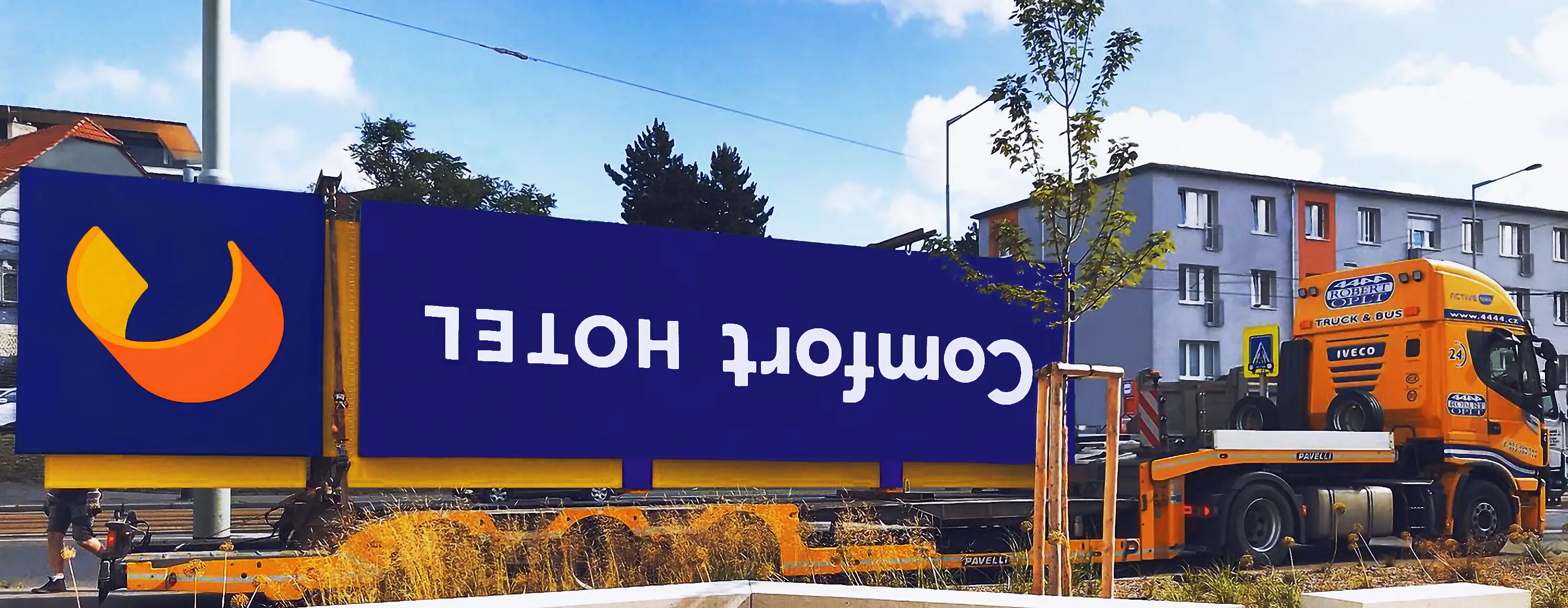
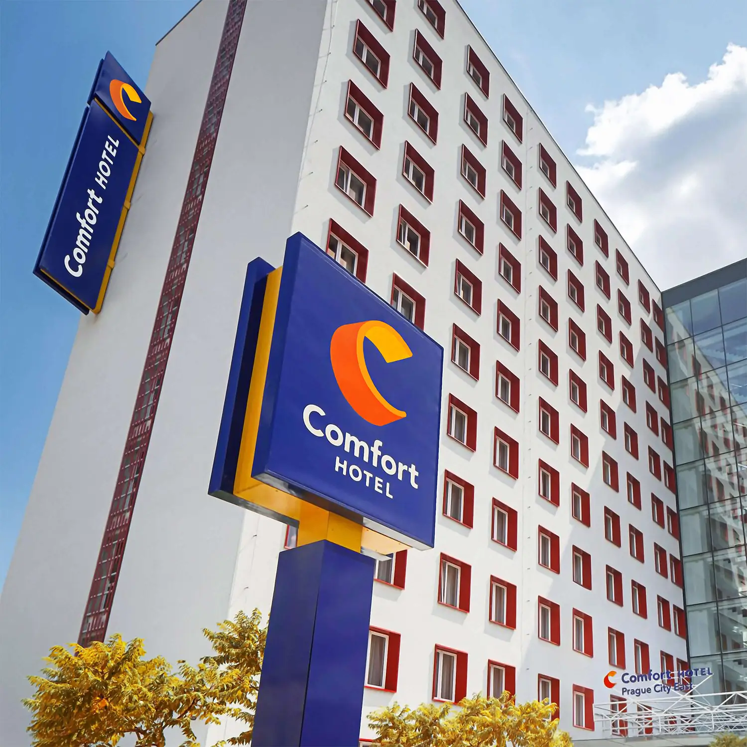
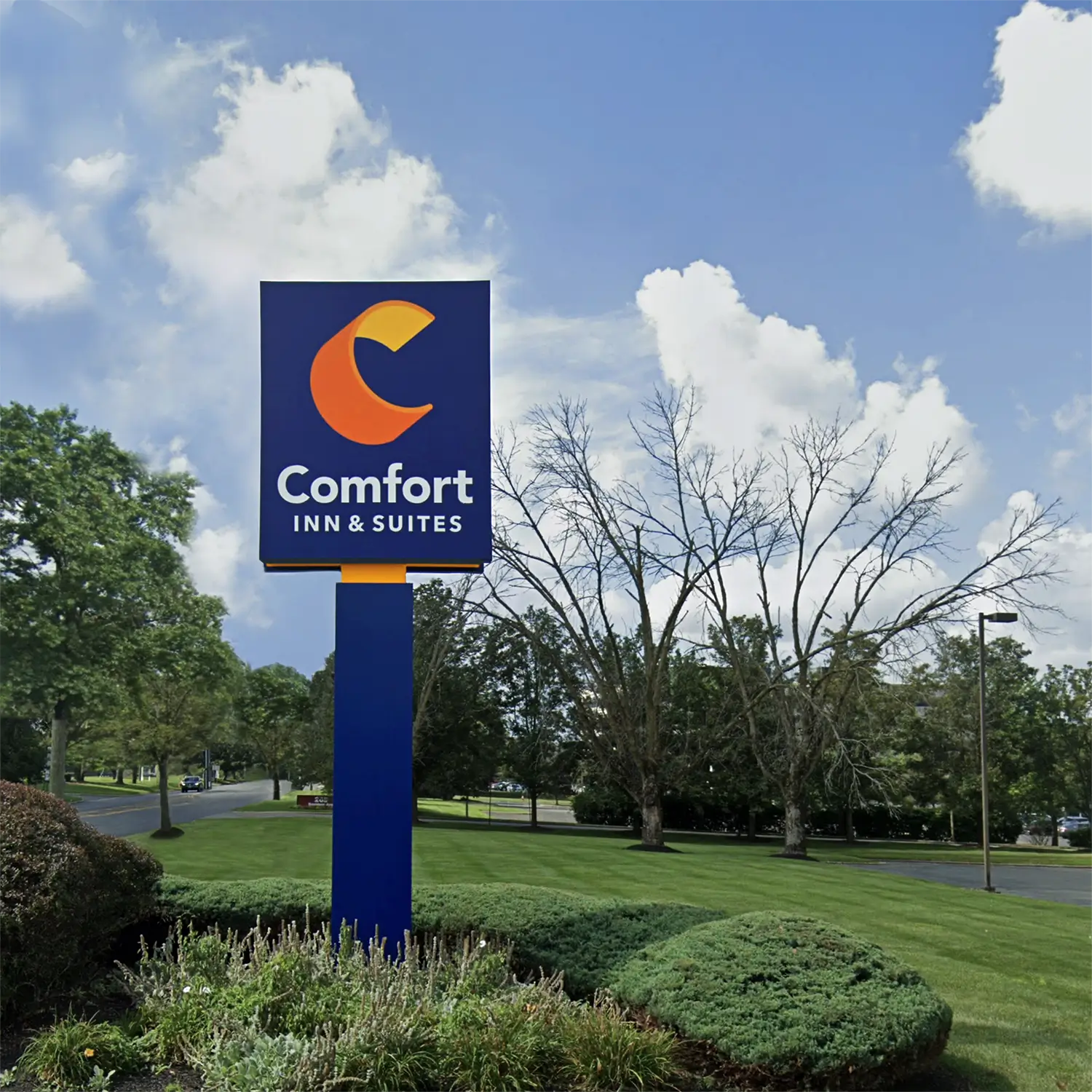
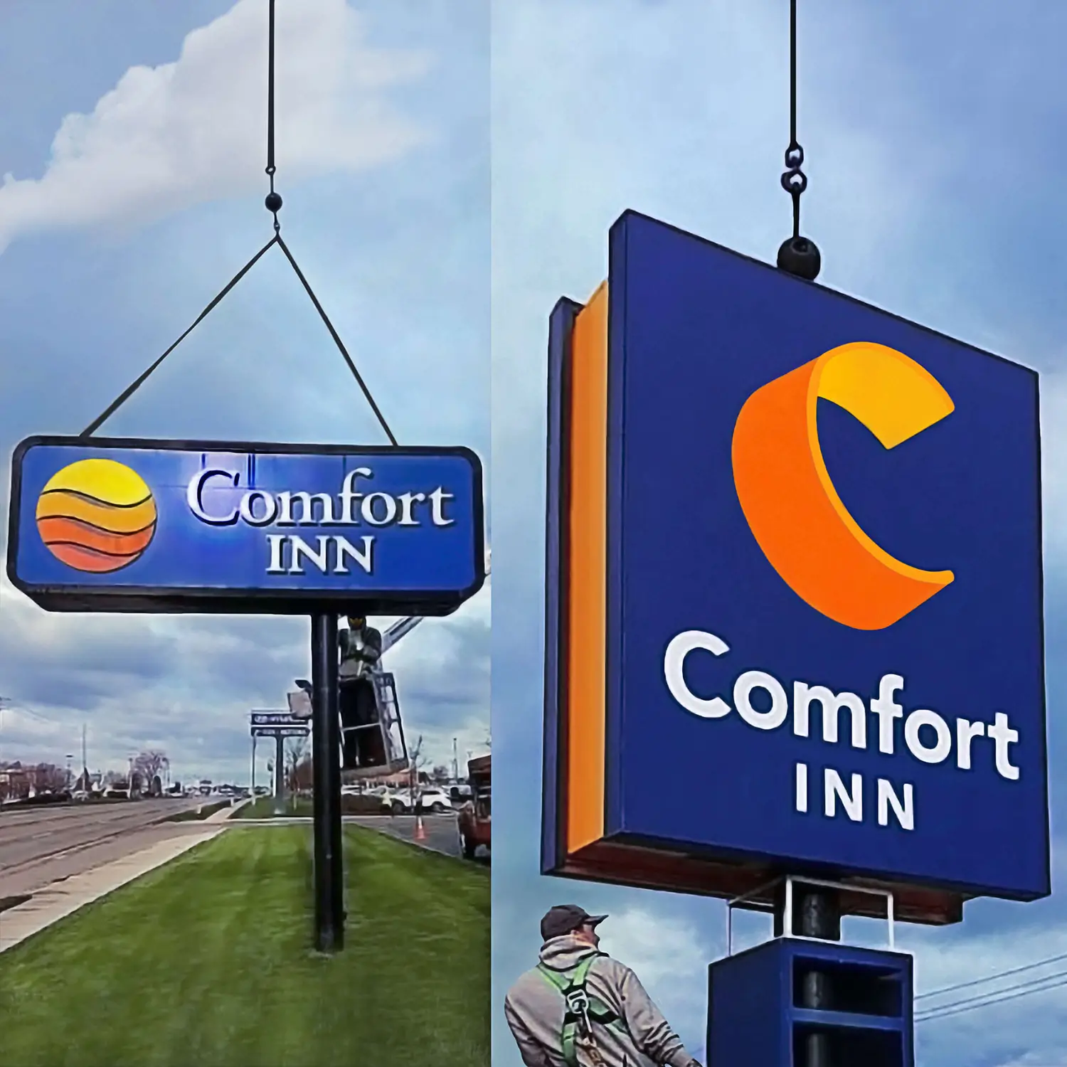
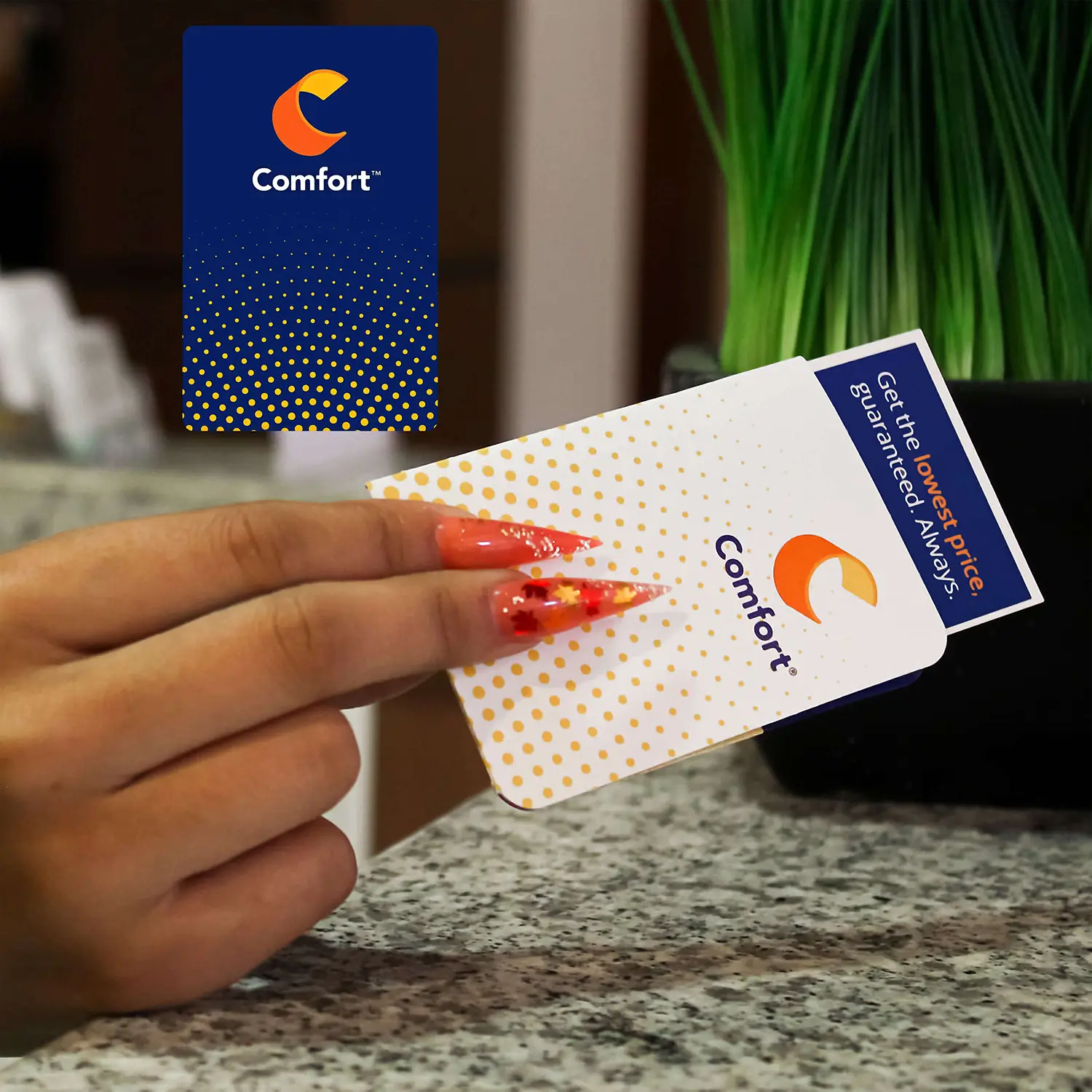
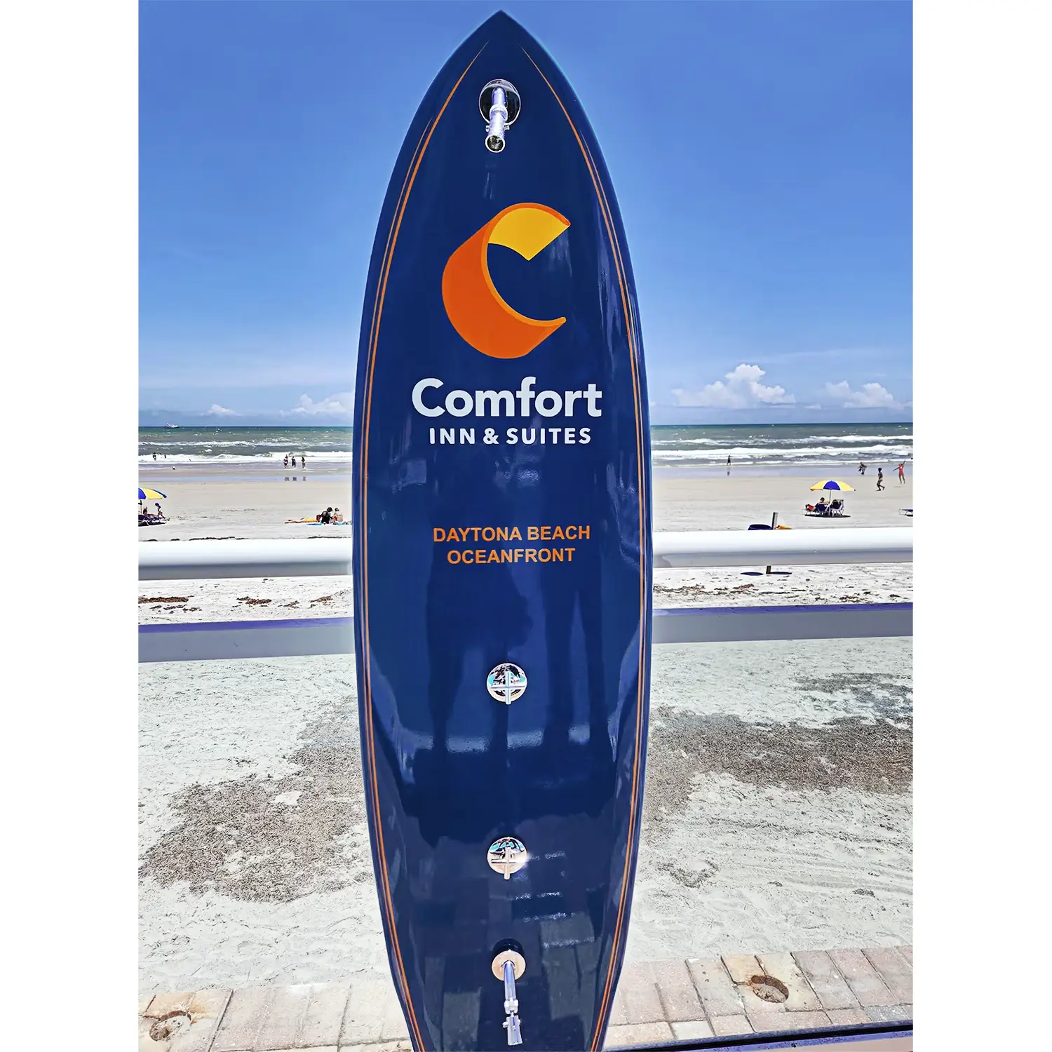
Comfort
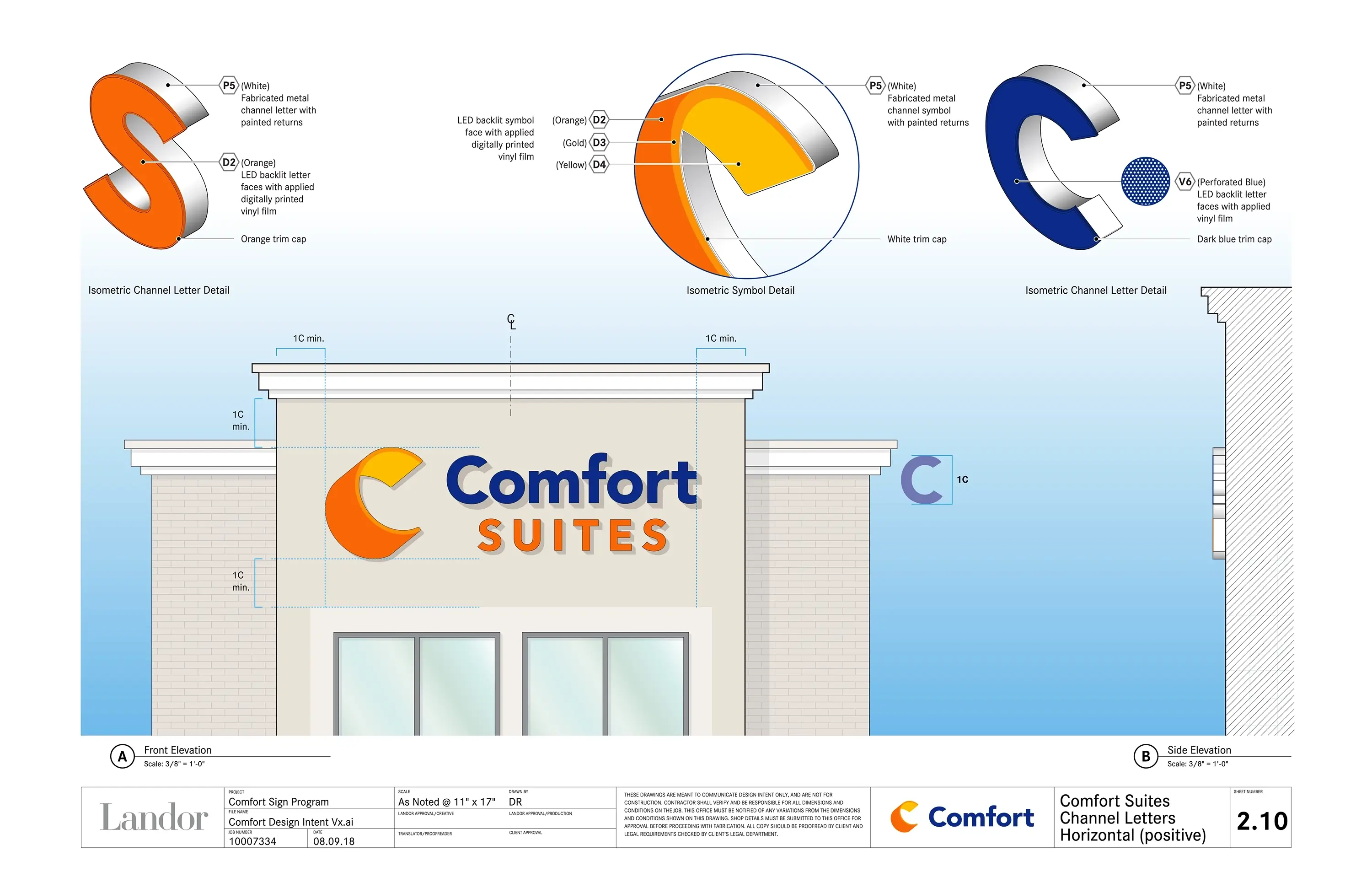
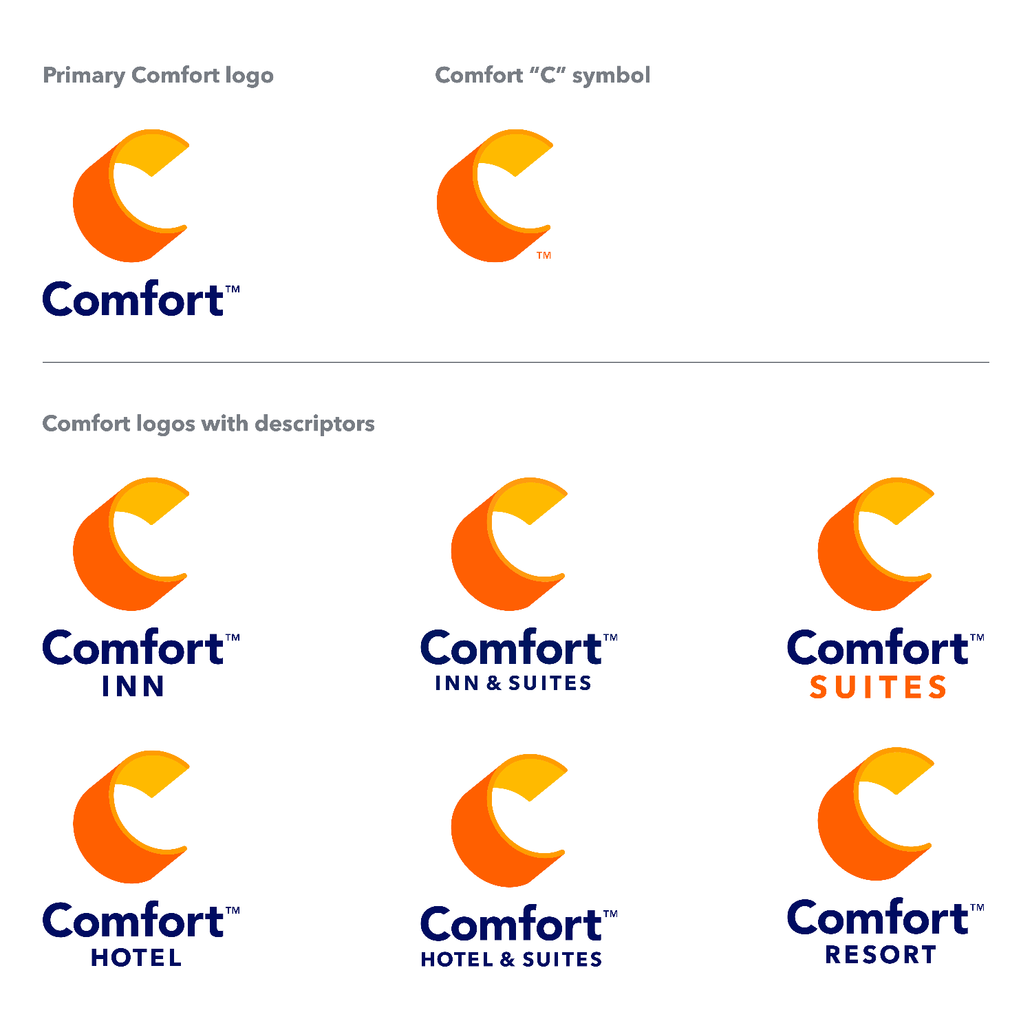
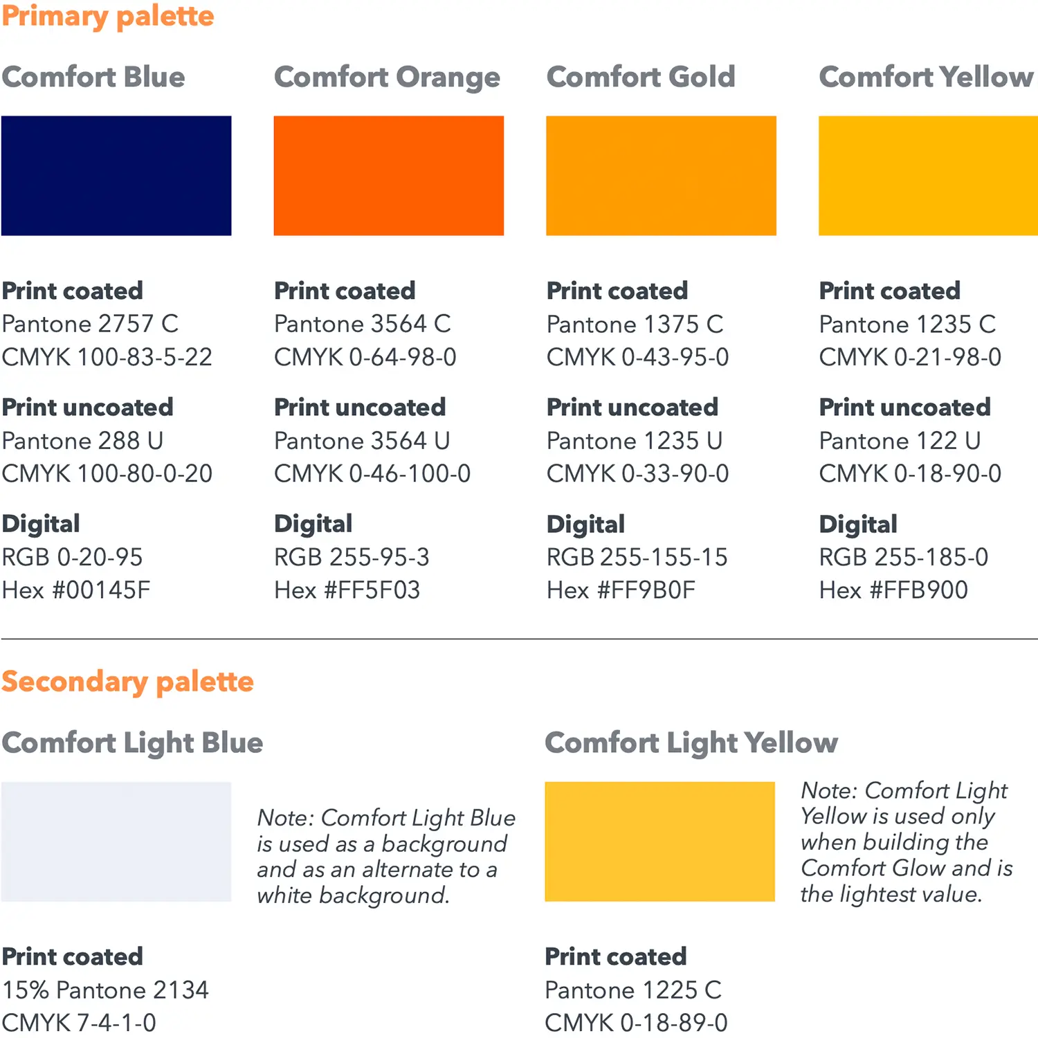
Landor modernized the identity of the global Comfort hospitality franchise with new logos, colors, supporting art, and an extensive signage overhaul for over 2,000 hotels. The former sun symbol was replaced by the iconic letter C to reinforce name identification. The more readable bold typeface heightened visual recognition. Strong colors brightened properties inside and out.